PARAGON DREAM PROPERTIES
Simple lines and architectural references create a contemporary corporate identity
PARAGON DREAM PROPERTIES:
We are a newly established real estate agency offering contemporary services. We mainly manage properties of high value and aesthetics. We are after a modern and timeless corporate identity, commensurate with the quality and specifications of our properties, which exudes confidence, quality and high aesthetics.
ISLAND12:
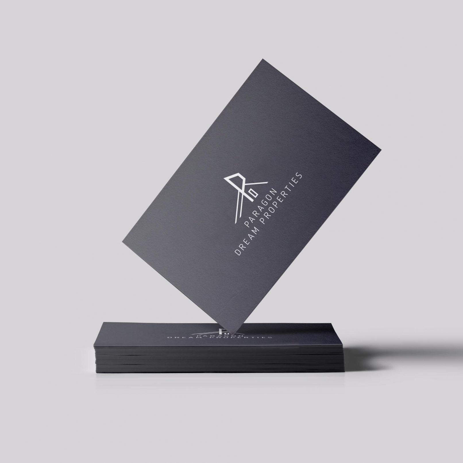
To design the new “Paragon Dream Properties” logo, we relied on the initial letter “P” as our main visual pilar and opted for a minimalistic and timeless approach with prominent architectural references.
The letter “P” has an angular shape to establish a more organic connection with the name “Paragon” while the use of diagonal lines running diagonally on its two sides, as well as a simple rectangular shape make the overall composition abstractly reminiscent of the facade of a modern property, such as those managed by the agency.
Regarding the colour palette, the choice of anthracite grey and the subsequent contrast with the white of the logo and the font highlight the prestige of a modern real estate agency that offers quality services.
CLIENT:
- PARAGON DREAM PROPERTIES


